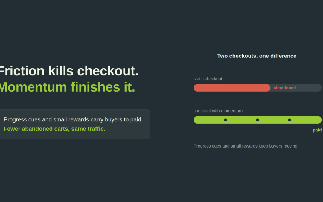
Environ sept paniers sur dix ne se transforment jamais en commande. Baymard situe le taux moyen d'abandon de panier à 70,22 pour cent, et ce chiffre n'a presque pas bougé en vingt ans, malgré de meilleures technologies, de meilleurs appareils et de meilleurs outils de conception. Le produit est choisi et le prix accepté. Puis le client s'en va. C'est le moment le plus coûteux de tout le parcours client, et il est largement réparable.
La gamification est l'un des points d'action qui le répare. Le mot sonne comme un gadget, mais le principe est simple. Les gens accomplissent une tâche plus volontiers quand il y a un objectif clair, un sentiment de contrôle, un retour immédiat et une petite récompense à l'arrivée. Un tunnel de paiement est une tâche. Conçu comme une bonne tâche, il est mené à son terme par davantage de gens.
Ce que la gamification fait réellement dans un tunnel
Vous n'avez besoin ni de classements, ni de points, ni de confettis. Dans un tunnel, la gamification tient en quatre choses qui fonctionnent ensemble.
Un objectif visible. Le client devrait toujours savoir combien d'étapes il reste et que la fin est proche. Un progrès montré est un progrès qui s'achève.
Un contrôle réel. Laissez le client corriger une adresse, changer une option de livraison ou modifier la commande sans être renvoyé plusieurs étapes en arrière. La friction, c'est ce qui arrive quand le système retire le contrôle.
Un retour instantané. Validez les saisies au moment où elles sont faites plutôt qu'après l'envoi. Un champ qui se confirme lui-même entretient l'élan.
Une vitesse ressentie. Chaque champ supprimé, chaque frappe épargnée et chaque valeur préremplie raccourcit la distance entre l'intention et le paiement.
Cadrez le tunnel ainsi et le client reste concentré sur la seule tâche qui compte, terminer la transaction, au lieu de recevoir des raisons de partir.
Le tunnel de paiement, cartographié comme un jeu de plateau
J'ai transformé tout le tunnel en jeu de plateau, parce que c'est exactement l'impression qu'il donne du côté client de l'écran. Chaque case est une pensée qui traverse son esprit pendant qu'il essaie de payer, et sur chaque case vous le faites avancer ou vous lui donnez une raison d'abandonner.
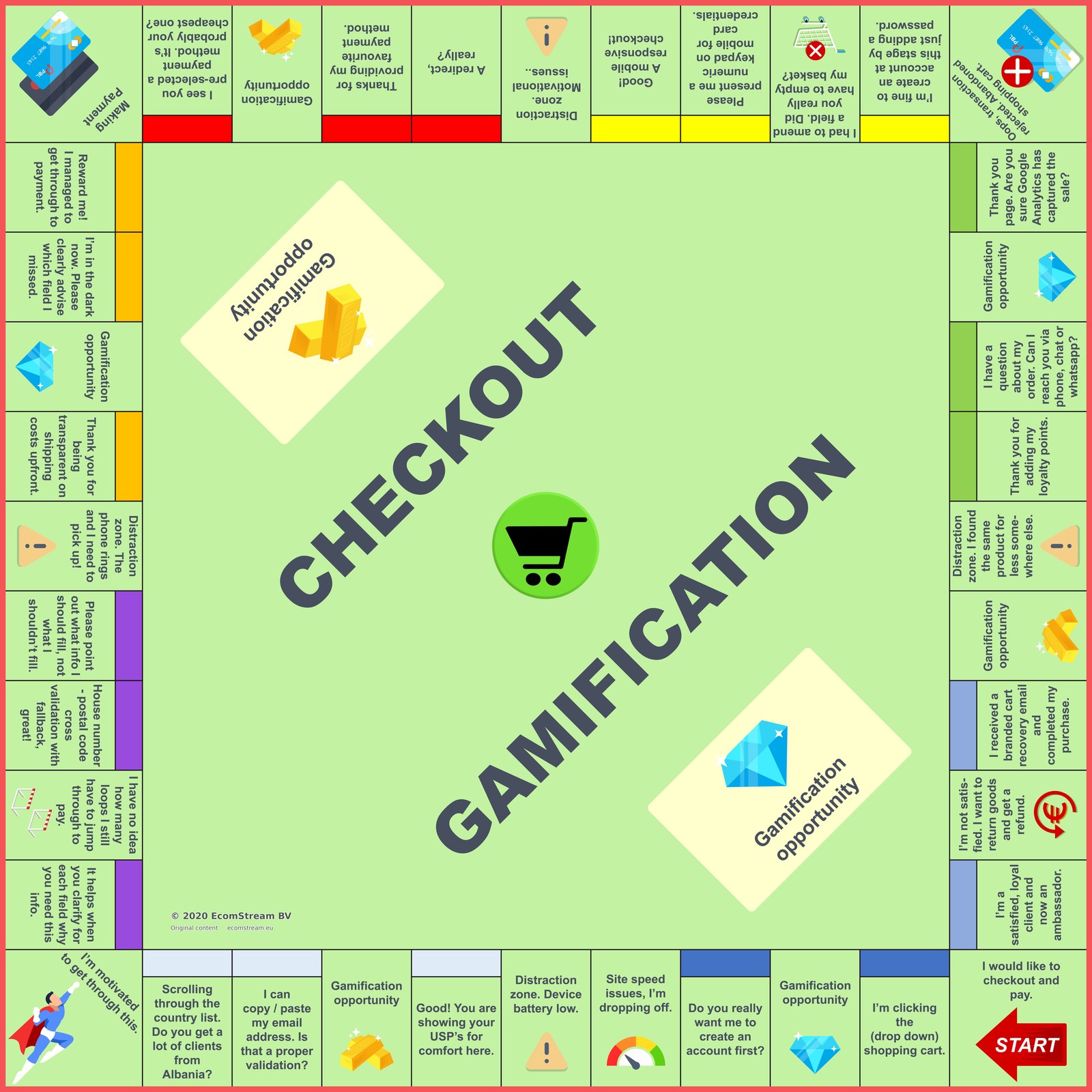
Le plateau du Checkout Gamification. De "je veux passer commande et payer" à "je suis un client satisfait et fidèle qui vous recommande", avec chaque distraction et chaque opportunité entre les deux.
On part de START, en bas à droite, au moment où le client clique pour payer. À partir de là, le plateau déroule tout le parcours, comme le monologue intérieur du client.
Les cases de distraction sont celles où vous le perdez. Le téléphone sonne, la batterie faiblit, une redirection casse le flux, ou il trouve le même produit moins cher ailleurs. Chacune est une sortie ouverte, et plus le tunnel est long et maladroit, plus le client en rencontre.
Les cases d'opportunité, les gemmes et les cases dorées, tirent dans l'autre sens. Des frais de livraison affichés d'emblée et sans ambiguïté. Un message clair sur le champ oublié, plutôt qu'une erreur vague. Son moyen de paiement préféré présélectionné et prêt. Vos arguments mis en avant au moment précis du doute. Des points de fidélité crédités à l'arrivée. Un e-mail de relance à votre image qui le ramène.
Les coins racontent l'histoire en miniature. Le paiement est le moment de vérité. Le panier abandonné, dans le coin opposé, est ce qui arrive quand le parcours casse. Et l'arrivée, où le client devient un ambassadeur satisfait et fidèle, est la case qui rapporte plus d'une fois.
Bien joué, le plateau transforme un processus tendu et exigeant en un processus que le client a envie de terminer. Mal joué, c'est la carte de toutes les façons dont sept clients sur dix s'en vont. Curieux de voir à quoi ressemble votre propre plateau, case par case ? La vérification du dispositif de paiement vous donne une première lecture en quelques minutes.
Où se situe réellement la friction
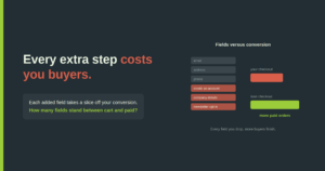
La plupart des conseils sur le tunnel de paiement s'arrêtent à la conception du formulaire, et cette conception compte vraiment. Un tunnel américain moyen affiche encore plus de 23 éléments de formulaire par défaut, et près d'un abandon sur cinq tient à un processus jugé trop long ou trop compliqué. Les tests de Baymard indiquent que les seuls problèmes d'ergonomie solubles peuvent améliorer la conversion d'environ 35 pour cent chez les grands marchands, avec quelque 260 milliards d'euros de commandes perdues récupérables aux États-Unis et dans l'Union européenne. L'enjeu est sérieux, et les correctifs pratiques ci-dessous en captent une part réelle.
Mais sous le formulaire se trouve une couche qui décide si un tunnel fluide se transforme vraiment en paiement réussi. J'y reviens, car c'est là que la plupart des marchands laissent le plus d'argent sur la table.
Mots de passe et création de compte
La création de compte obligatoire et les règles de mot de passe rigides sont de la friction pure. Si vous imposez un format, annoncez les règles avant que le client ne saisisse, pas après un échec. Mieux encore : proposez le paiement en tant qu'invité et créez le compte discrètement après la commande. Chaque essai-erreur dans le champ du mot de passe est un cycle où la motivation baisse et où la sortie devient plus attirante.
Le champ de saisie de la carte
Un seul champ intitulé "Numéro de carte" suffit. Les clients savent rarement si leur carte est une Visa ou une Mastercard, et cela leur est égal. Leur demander de choisir ajoute une décision qui ne sert personne. Utilisez la validation de Luhn pour vérifier la forme du numéro dès la saisie, et affichez-le en quatre blocs de quatre chiffres, comme sur la carte physique. Cela reflète ce que le client a en main et intercepte les erreurs de saisie avant qu'elles n'atteignent l'acquéreur.
Des dates de livraison, pas des délais
Annoncez au client la date d'arrivée de la commande, pas qu'elle part sous deux jours ouvrés. Les gens s'organisent autour de l'arrivée, pas de l'expédition. C'est la différence entre un horaire de train qui indique l'heure d'arrivée à destination et un horaire qui n'indique que le départ. Une date d'arrivée concrète gère l'attente et retire un motif fréquent d'hésitation.
Un compte à rebours visible avant l'heure limite
Si la livraison du lendemain dépend d'une heure limite, montrez le temps restant. "Commandez dans les 3 heures 12 minutes pour une livraison demain" crée un objectif clair et une raison douce de terminer maintenant. La rapidité de livraison n'est plus un facteur de différenciation en soi : c'est celui qui la communique le mieux qui emporte le moment.
Le retrait en magasin comme option à part entière
Les retailers omnicanaux devraient présenter le click and collect comme une option de livraison visible, pas comme une note de bas de page. Pour beaucoup de clients, il supprime d'un coup les frais et l'attente, et les coûts inattendus restent la première cause d'abandon. Afficher le retrait tôt protège la commande.
Une page de récapitulatif qui permet de corriger sur place
Laissez le client confirmer et corriger les détails de la commande sur la page de récapitulatif elle-même. Le renvoyer dans les étapes précédentes pour un seul champ invite à la confusion, à la ressaisie et à l'abandon au dernier moment possible. Gardez le contrôle là où la décision se prend.
La couche de paiement que la plupart des conseils ignorent
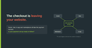
Voici ce que les blogs UX disent rarement. Un tunnel beau, fluide et gamifié perd quand même de l'argent si le paiement lui-même sous-performe. Le formulaire amène le client jusqu'au point de paiement. Ce qui se passe à ce point et après dépend de votre payment set-up, et c'est une discipline distincte.
Trois choses font discrètement fuir la conversion après que le client a appuyé sur payer.
Les taux d'autorisation. De faibles différences dans la manière dont les transactions sont routées, relancées et présentées à l'acquéreur déplacent déjà la part des paiements acceptés. Mesurés en chiffre d'affaires, quelques points de taux d'autorisation pèsent plus lourd que presque toute retouche du front-end, et c'est pourquoi tirer davantage de votre PSP est en général le gain le plus rapide sur le plateau.
Le payment mix. Proposer les moyens que vos clients veulent réellement, dans le bon ordre, marché par marché, réduit les abandons plus sûrement que n'importe quelle finition visuelle. Un moyen local manquant est une cause d'abandon silencieuse qui n'apparaît dans aucun test d'ergonomie. C'est aussi un thème récurrent dans les cas clients.
La friction SCA. Sous la DSP2, chaque authentification supplémentaire est un décrochage possible. Bien utilisés, la 3DS, les exemptions au titre de la transaction risk analysis, les exemptions de faible montant et le marquage des merchant-initiated transactions évitent cette étape aux clients qui n'en ont pas besoin. La plupart des marchands appliquent ces règles plus grossièrement que nécessaire, et le paient en conversions perdues.
Gamifier le formulaire en ignorant la couche de paiement, c'est polir la porte en laissant la serrure coincée. Les deux s'optimisent ensemble.
Les fondements de ces techniques sont exposés en détail dans mon article évalué par les pairs, Gamification in the online checkout process: Enhancing loyalty and conversion, paru dans Applied Marketing Analytics: The Peer-Reviewed Journal (Henry Stewart Publications, volume 11, numéro 3, 2025, pages 246 à 255). J'y confronte cinq techniques, les indicateurs de progression, la saisie personnalisée et accélérée, les récompenses à débloquer, la preuve sociale et les paliers de fidélité, à la littérature académique et aux données de tests publiées.
Comment EcomStream s'y prend
EcomStream optimise les coûts PSP et la payment performance des retailers et des marques partout en Europe. Je suis indépendant et je travaille uniquement pour les marchands, jamais pour les PSP ou les acquéreurs, de sorte que le résultat sert votre marge et votre conversion, pas la commission d'un prestataire.
Cette indépendance compte surtout au niveau de la couche de paiement, là où votre PSP et votre acquéreur ont un intérêt commercial au statu quo et où il vous faut quelqu'un dont le seul intérêt est votre résultat. Je réduis les coûts PSP, mène des appels d'offres paiement et améliore la payment performance, et je suis disponible pour des missions d'intérim quand il vous faut une capacité paiement senior dans l'équipe. Chaque mission est menée personnellement par le fondateur Ramon Helwegen, dans les paiements depuis 2009, dont huit ans côté vente chez un PSP.
Je travaille en no cure, no pay. Aucun honoraire d'avance, aucun forfait fixe. Ma rémunération dépend du résultat obtenu, ce qui veut dire que l'analyse ne vous coûte rien pour savoir où vous en êtes.
Vous voulez voir ce que votre tunnel et votre payment set-up vous coûtent réellement ? Demandez un diagnostic gratuit du tunnel et des paiements. Écrivez à ramon@ecomstream.nl ou appelez le +31 (0)85 00 23 062.
Envie d'en lire plus ? Découvrez les bases des paiements en ligne.
Pour aller plus loin : comment le tunnel et la couche de paiement forment un seul système, dans l'optimisation du tunnel de paiement.
Un entretien suffit pour établir s'il existe un potentiel d'économies
Un entretien Teams d'une demi-heure, sur vos propres chiffres. Vous ne payez aucun honoraire d'avance, quelle que soit la prestation. Rien à préparer, les grandes lignes suffisent.


