Roughly seven in ten carts never convert. Baymard puts the average cart abandonment rate at 70.22 percent, and that number has barely moved in two decades despite better technology, better devices and better design tools. The product has been chosen and the price has been agreed. Then the customer walks. It is the most expensive moment in the entire customer journey, and it is largely fixable.
Gamification is one of the levers that fixes it. The word sounds like a gimmick, but the principle is plain. People complete tasks more willingly when there is a clear goal, a sense of control, immediate feedback and a small reward for finishing. A checkout is a task. Design it like a good one and more people finish it.
What gamification actually does in a checkout
You do not need leaderboards, points or confetti. In a checkout, gamification means four things working together.
A goal that is visible. The customer should always know how many steps remain and that the end is close. Progress that is shown is progress that gets completed.
Control that is real. Let the customer correct an address, change a delivery option or edit the order without being thrown back several steps. Friction is what happens when the system takes control away.
Feedback that is instant. Validate inputs the moment they are entered rather than after submission. A field that confirms itself keeps momentum going.
Speed that is felt. Every removed field, every saved keystroke and every pre-filled value shortens the distance between intent and payment.
Frame the checkout this way and the customer stays focused on the one task that matters, completing the transaction, instead of being given reasons to leave.
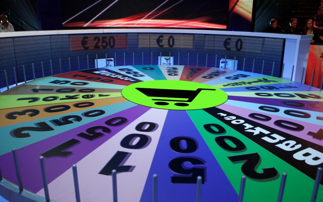
The checkout, mapped as a board game
We turned the whole checkout into a board game, because that is exactly how it feels from the customer’s side of the screen. Every square is a thought running through their head as they try to pay, and on every square you either move them forward or hand them a reason to quit.

The Checkout Gamification board. From “I would like to checkout and pay” to “I’m a satisfied, loyal ambassador”, with every distraction and every opportunity in between.
Start at START, bottom right, the moment the customer clicks through to pay. From there the board runs the full journey as the customer’s own running monologue.
The distraction zones are where you lose them. The phone rings, the device battery is low, a redirect breaks the flow, or they spot the same product cheaper somewhere else. Each one is a live exit, and the longer and clumsier the checkout, the more of them the customer hits.
The gamification opportunities, the gem and gold squares, are the levers that pull the other way. Shipping costs shown transparently and upfront. Clear guidance on which field was missed, instead of a vague error. Their favourite payment method pre-selected and ready. Your USPs surfaced at the exact moment of doubt. Loyalty points added at the finish. A branded cart-recovery email that brings them back.
The corners tell the story in miniature. Making Payment is the moment of truth. The abandoned cart in the opposite corner is what happens when the journey breaks. And the finish, where the customer becomes a satisfied, loyal ambassador, is the square that pays you more than once.
Played well, the board turns a tense, task-heavy process into one the customer actually wants to finish. Played badly, it is a map of every way seven in ten of them leave. Curious what your own board looks like, square by square? Our PSP Upside Calculator gives you a first read in minutes.
Where the friction actually sits
Most checkout advice stops at form design, and form design genuinely matters. The average US checkout still shows shoppers more than 23 form elements by default, and nearly one in five abandonments are tied to a process that feels too long or too complicated. Baymard’s testing suggests the solvable usability issues alone can lift conversion by around 35 percent for large merchants, with roughly 260 billion euros of lost orders recoverable across the US and EU. That is a serious prize, and the practical fixes below capture a meaningful share of it.
But there is a layer underneath the form that decides whether a smooth checkout actually turns into a successful payment. We will come back to it, because it is where most merchants leave the most money on the table.
Passwords and account creation
Forced account creation and rigid password rules are pure friction. If you require a password format, state the rules before the customer types, not after a failed attempt. Better still, offer guest checkout and let the account be created silently after the order. Every cycle of trial and error at the password field is a cycle in which motivation falls and the exit becomes more attractive.
The card input field
A single field labelled “Card number” is enough. Customers rarely know or care whether their card is a Visa or a Mastercard, and asking them to choose adds a decision that serves no one. Use Luhn validation to confirm the number is well formed the moment it is entered, and display the number in four blocks of four digits, the same way it appears on the physical card. This mirrors what the customer is holding and cuts entry errors before they reach the acquirer.
Delivery dates, not delivery windows
Tell the customer the date the order arrives, not that it ships in two working days. People plan around arrival, not dispatch. It is the difference between a train timetable that shows your destination time and one that only shows when you board. Concrete arrival dates manage expectations and remove a common reason to hesitate.
A visible cut-off countdown
If next-day delivery depends on ordering before a deadline, show the time remaining. “Order within 3 hours 12 minutes for delivery tomorrow” creates a clear goal and a gentle reason to finish now. Speed of delivery is no longer a differentiator on its own, so the merchant who communicates it best wins the moment.
Store pickup as a first-class option
Omnichannel retailers should present click and collect as a prominent shipping option, not a footnote. For many customers it removes the shipping cost and the wait at once, and unexpected costs remain the single largest driver of abandonment. Surfacing pickup early protects the order.
An order review page that lets people edit in place
Let customers confirm and correct order details on the review page itself. Sending them back through earlier steps to fix one field invites confusion, re-entry and abandonment at the last possible moment. Keep control where the decision is being made.
The payment layer most checkout advice ignores
Here is what UX blogs rarely say. A beautiful, frictionless, gamified checkout still loses money if the payment itself underperforms. The form gets the customer to the point of payment. What happens at and after that point is decided by your payment setup, and that is a separate discipline.
Three things quietly drain conversion after the customer has pressed pay.
Authorization rates. Even small differences in how transactions are routed, retried and presented to the acquirer move the share of payments that get approved. A few points of authorization rate dwarf almost any front-end tweak in revenue terms, which is why getting more from your PSP is usually the fastest win on the board.
The payment method mix. Offering the methods your customers actually want, in the right order, in each market, reduces abandonment more reliably than any visual flourish. A missing local method is a silent abandonment cause that never shows up in your UX tests. It is also a recurring theme across our client cases.
SCA friction. Under PSD2, every step-up authentication is a potential drop-off. Correct use of 3DS, transaction risk analysis exemptions, low-value exemptions and merchant-initiated transaction flagging keeps friction off the screen for the customers who do not need it. Most merchants apply these far more bluntly than they need to, and pay for it in lost conversions.
Gamifying the form while ignoring the payment layer is polishing the door while leaving the lock jammed. The two have to be optimised together.
How EcomStream approaches it
EcomStream optimises payment costs and performance for retailers and brands across Europe. We are independent by design and work only for merchants, never for PSPs or acquirers, so the advice you get serves your margin and your conversion, not a provider’s commission.
That independence matters most precisely at the payment layer, where your PSP and acquirer have a commercial interest in the status quo and you need someone whose only interest is your result. We cut PSP costs, run payment RFPs and improve payment performance, and we are available for interim assignments when you need senior payment capacity inside the team. Every engagement is handled personally by founder Ramon Helwegen, who has worked in payments since 2009, including eight years on the PSP sales side, so he knows exactly where the value and the slack are hidden.
We work on a no cure, no pay basis. No upfront fee, no fixed retainer. Our fee is based on the result we deliver, which means the analysis costs you nothing to find out where you stand.
Ready to see what your checkout and payment setup are actually costing you? Request a free checkout and payment diagnostic. Email info@ecomstream.nl or call +31 (0)85 00 23 062.
Want more like this? Learn the fundamentals of online payments.