
01
Checkout flow optimisation
The moment a shopper clicks "checkout", their mindset changes. During browsing they are curious, exploratory, engaged. The instant the decision to buy is made, that state shifts to task-completion, and task-completion is fragile. In a physical store a shopper who reaches the till almost always pays. Online, the same shopper is one click away from disappearing, and roughly seven in ten of them do.
This is the most emotionally charged and commercially decisive step in the entire customer journey, and it is the one that receives the least creative and strategic attention. Brands invest heavily in traffic, branding and top-funnel engagement, then hand the customer a friction-filled checkout that quietly undoes that investment at the final moment.
Checkout optimisation, or checkout flow optimisation in full, is the discipline of closing that gap. It is where I have done original, published work, and it sits at the exact intersection that defines EcomStream: conversion and payments, treated as one problem rather than two.
Checkout optimisation is a payments problem, not just a UX problem
Most checkout advice stops at form design. Form design matters, but it is only the visible half. A beautifully designed, frictionless, gamified checkout still loses money if the payment layer underneath it underperforms. The form gets the customer to the point of payment. What happens at and after that point is decided by your payment setup, and that is a separate discipline most CRO specialists never touch.
Three things quietly drain conversion after the customer has pressed pay. Authorisation rates, where small differences in how transactions are routed, retried and presented to the acquirer move the share of payments that get approved, and a few points of authorisation rate dwarf almost any front-end tweak in revenue terms. The payment method mix, where a missing local method is a silent abandonment cause that never shows up in a UX test. And SCA friction, where every unnecessary step-up authentication under PSD2 is a potential drop-off that correct use of TRA exemptions and merchant-initiated transaction flagging would have avoided.
Optimising the checkout flow while ignoring the payment layer is polishing the door while leaving the lock jammed. The two have to be worked together, and almost nobody does. That is the gap EcomStream works in.
A worked example: updating a stored card
The gap between checkout UX and the payment layer is easiest to see in a single concrete case: what happens when a returning customer needs to update the card you have on file. Baymard Institute research found that 84 per cent of sites either do not let users edit a stored card or fail to make the path clear, even though a large share of customers receive a new card every year or two. The cause is a mismatch. The customer expects to edit the number like any other field, but PCI rules forbid storing the full card number, so technically it can only be deleted and re-added.
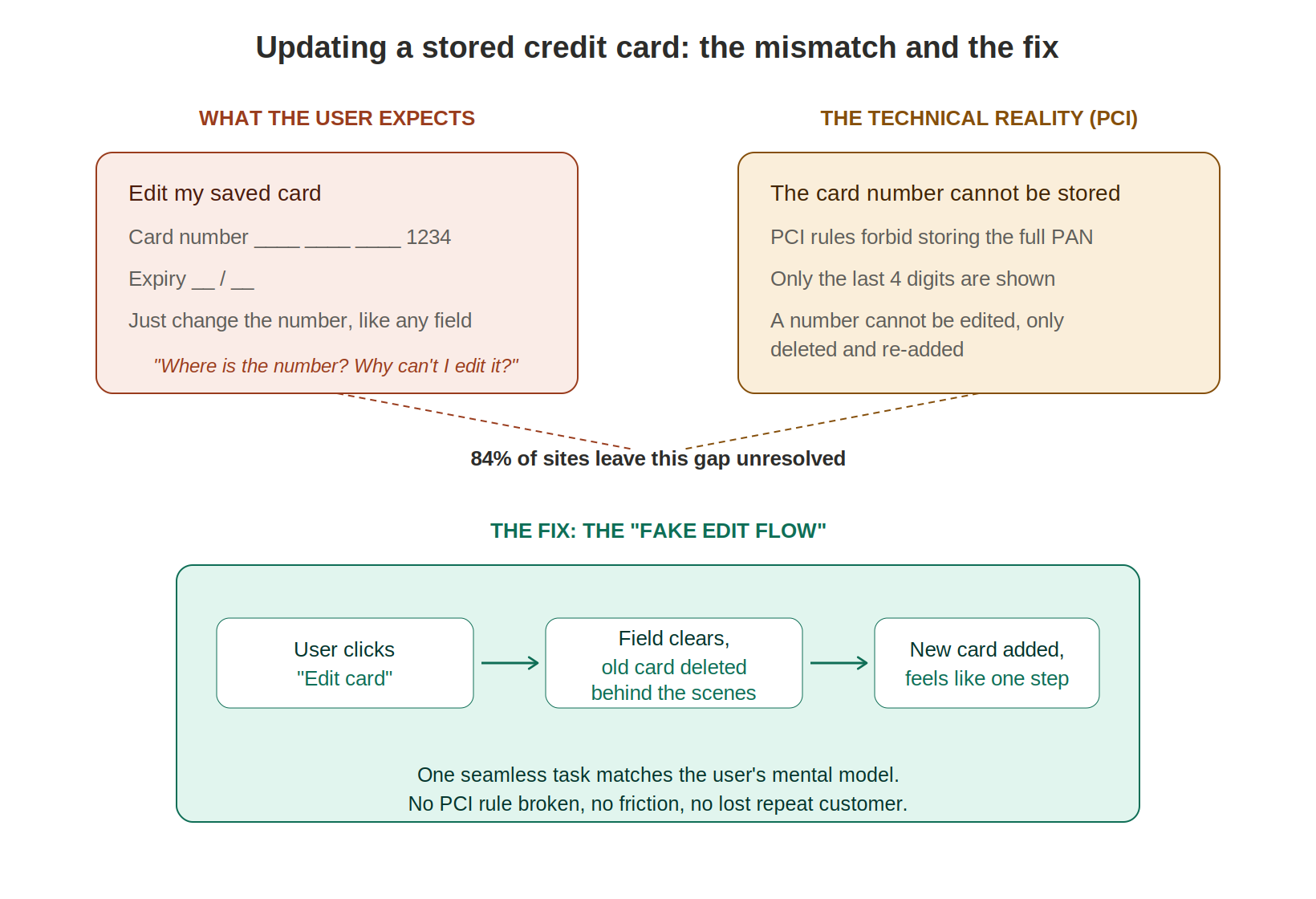
The fix Baymard documents is the "fake edit flow": present a single "edit card" action that quietly deletes the old credential and adds the new one behind the scenes, so it matches the customer's mental model without breaking any rule. It is a small detail, but it sits exactly where conversion, UX and the payment layer meet. A returning customer with a declined or expired card is one badly designed screen away from abandoning, and that is a customer you have already paid to acquire. This is the kind of friction an independent review surfaces, and the kind your PSP will rarely raise on its own. The Baymard research is published at baymard.com.
Checkout gamification as a behavioural framework, not a gimmick
The word gamification sounds like confetti and spinning wheels. The principle underneath it is rigorous behavioural science. People complete tasks more willingly when there is a visible goal, a sense of control, immediate feedback and a small reward for finishing. A checkout is a task. Designed like a good one, more people finish it.
The Fogg Behavior Model, applied to payment
The behavioural foundation for all of this is the Fogg Behavior Model, developed by Stanford researcher B.J. Fogg. EcomStream works with the model under licence. It states that a behaviour occurs when three elements coincide: motivation, ability and a prompt. B equals MAP. When any one of the three is missing, the behaviour does not happen.
Plotted on two axes, motivation runs from low to high on the vertical, ability from hard to easy on the horizontal. A curved action line runs from top-left to bottom-right. Above the line, a prompt succeeds. Below it, the prompt fails, because either motivation is too low or the task is too hard. The practical lever is simple: raise motivation, make the task easier, or both, until the shopper crosses the line and the prompt works.
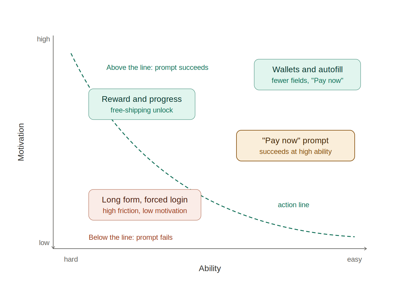
In checkout and payment terms, this translates directly. Motivation is the reason to continue: visible progress, a free-shipping unlock, loyalty points appearing at the pay moment, a small time-limited bonus. Ability is how easy paying actually is: autofill, wallet-based one-click payment, fewer fields, clear messages, smart defaults. The prompt is the explicit call to act, a clear "Pay now" or "Claim reward". When a payment step feels hard, the shopper sits below the action line and no prompt will convert them. Add a small incentive to lift motivation, or simplify the step to lift ability, and the same prompt that failed a moment ago now succeeds.
This is why a missing local payment method or an unnecessary 3DS challenge is so expensive. Both push the shopper down and to the left, below the line, at the exact moment you are asking them to pay. The payment layer is not separate from the behavioural model. It is one of its biggest levers.
Published research on checkout optimisation
My paper, Gamification in the online checkout process: Enhancing loyalty and conversion, was published in Applied Marketing Analytics (Vol. 11, No. 3, 2025, Henry Stewart Publications) and is included in The Business & Management Collection.
It synthesises academic evidence, practitioner experiments and market data into five deployable techniques: progress indicators, personalisation and interactive prompts, unlockable rewards, social proof, and loyalty levelling. It maps each to the checkout journey, summarises the expected uplift, the risks and the contexts where each fits best, and proposes an ethics-first, A/B-driven playbook that prioritises wallets and autofill, layers in rewards and social validation judiciously, and measures both immediate completion and downstream loyalty.
The headline findings: progress indicators and personalisation drive near-term conversion gains, with one documented test showing a 9.1 per cent lift from adding a progress bar alone. Unlockable rewards and social proof raise purchase intention through anticipation and competitive arousal. Loyalty tiers shift the longer-horizon metrics, with evidence of 15 to 25 per cent revenue lift among redeemers. The strongest impact comes when tactics reduce cognitive load on mobile, surface value at the pay moment, and avoid dark-pattern urgency.
You can read the paper, Gamification in the online checkout process: Enhancing loyalty and conversion, via its DOI, or through The Business & Management Collection at hstalks.com/business.
The checkout, mapped as a board game
To make the friction visible, I mapped the entire checkout as a Monopoly-style board, because that is exactly how it feels from the customer's side of the screen. Every square is a thought running through their head as they try to pay, and on every square you either move them forward or hand them a reason to quit.
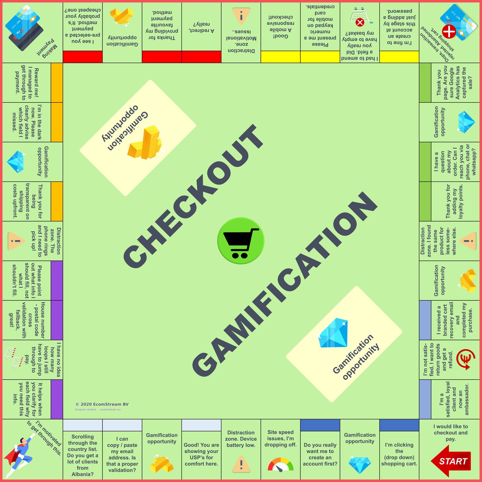
The distraction squares are where you lose them: the phone rings, the battery is low, a redirect breaks the flow, they spot the product cheaper elsewhere. The gamification opportunity squares are the levers that pull the other way: shipping cost shown upfront, a clear prompt about which field was missed, their preferred payment method pre-selected, loyalty points added at the finish, a branded recovery email that brings them back. Played well, the board turns a tense, task-heavy process into one the customer actually wants to finish. Played badly, it is a map of every way seven in ten of them leave.
The behavioural principles behind checkout process optimisation
Beyond Fogg, a few well-documented effects explain why a well-designed checkout converts. The Zeigarnik effect, that people are driven to complete tasks they have started, which is why progress bars and "almost there" prompts work. Loss aversion, where the pain of losing something outweighs the pleasure of gaining it, which is why a well-judged "you're about to lose free shipping" can spur action where a discount would not. And variable reward, the mechanic behind habit formation, which is why a checkout that occasionally surprises keeps shoppers coming back.
None of this is about turning your shop into a game. It is about borrowing what makes games satisfying, applied with restraint and measured rigorously. Used unethically, through fake scarcity, manipulative urgency or dark patterns, it erodes trust faster than it builds conversion. The framework in the paper is explicitly ethics-first for that reason: transparency on odds, easy opt-outs, no interrupting the flow, no anxiety-inducing tactics.
Mobile-first, because that is where ecommerce checkout friction lives
Most European e-commerce sessions now happen on mobile, and mobile is where small details decide outcomes. Auto-triggering the numeric keypad on card and phone fields. Buttons and inputs reachable with a thumb without zooming. Visual or haptic feedback that confirms a field is correct the moment it is entered. A 3DS challenge that returns cleanly to your confirmation page instead of stranding the customer in a new tab. These are not cosmetic. Each one is a measurable share of completed payments, and they rarely surface in standard PSP reporting.
Where checkout flow optimisation meets the payment layer
Checkout flow optimisation sits where conversion, behavioural design and payment performance meet. The front-end checkout and the payment layer behave as one system. A form field that costs you completions and a routing rule that costs you authorisations surface as the same lost order, so optimising either in isolation leaves money on the table.
Analytics will show you where sessions drop out of the checkout. What it will not show is how much of that drop sits in the payment layer underneath, in 3DS challenge rates, issuer declines, retry behaviour and method availability. Reading the two together is what turns a list of checkout observations into a figure you can act on. Work on the payment layer itself is covered under Get more from your PSP.
02
Clients worked for















One conversation is enough to know whether there is anything here
A thirty-minute Teams call, on your own figures. You pay no upfront fee on any of the services. Nothing to prepare, the outline is enough.


